In this image the background is a little bit too dark and the model isn't staring at the audience, the effect of this causes us to feel shut out.
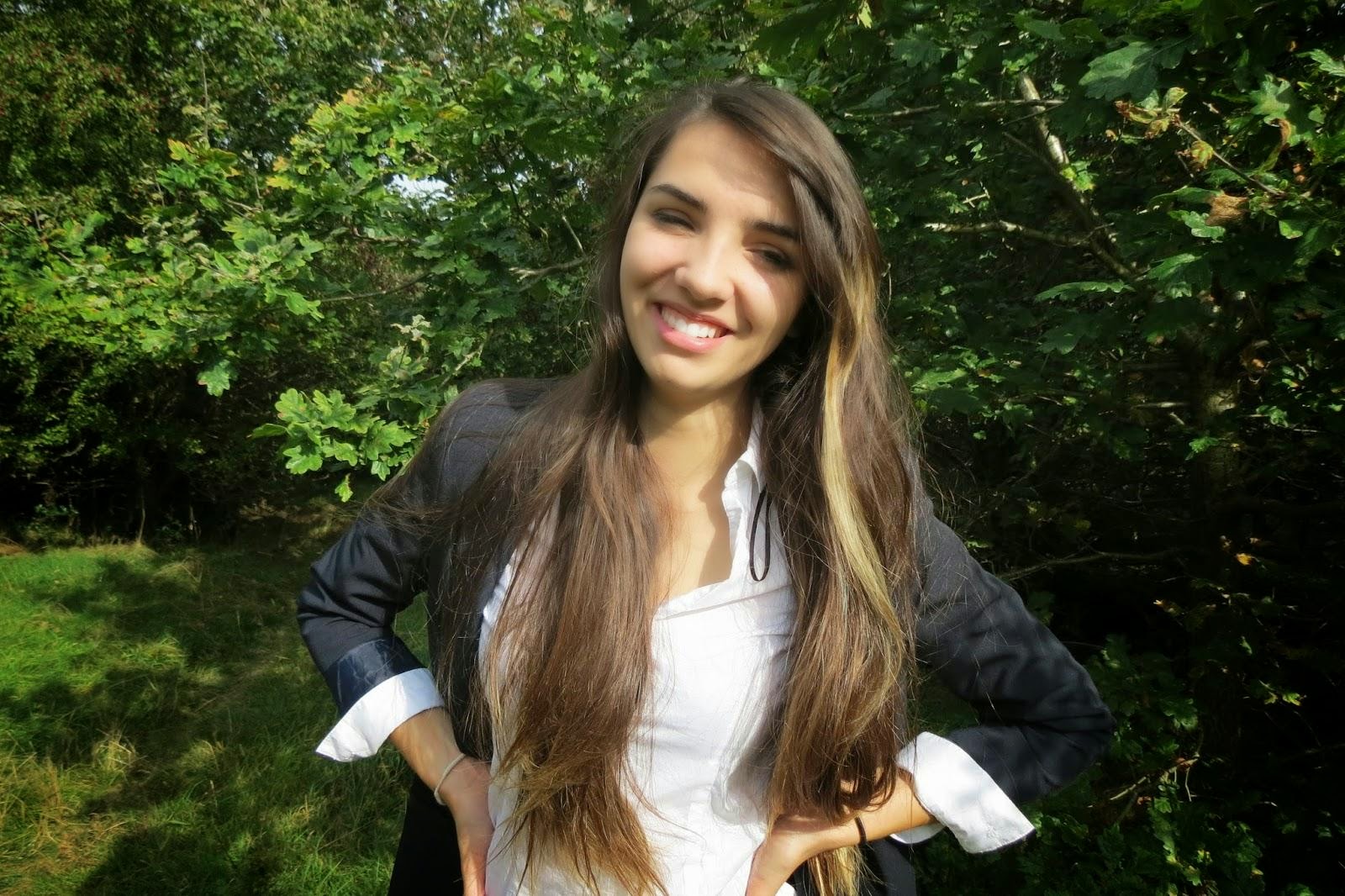
We have chosen to use this picture on the front cover of our magazine, this is because the model is facing the audience, the lighting works well and she has a nice facial expression which looks accessible to people wanting to buy the magazine.
This photo is relatively decent because the lighting and background work well, but the model isn't pulling a very serious face, which is why we didn't chose this photo as it doesn't represent the school well.