This blog will be posts based around my Media Studies coursework where I will be analyzing magazines.
Monday, 8 December 2014
Tuesday, 25 November 2014
Masthead for music magazine
This is the masthead I will be using for my magazine front cover, using format research I identified that a lot of Punk/Rock magazines have a grunge related theme for the font so I made sure to edit the surroundings of the text so that it looks worn.
Friday, 21 November 2014
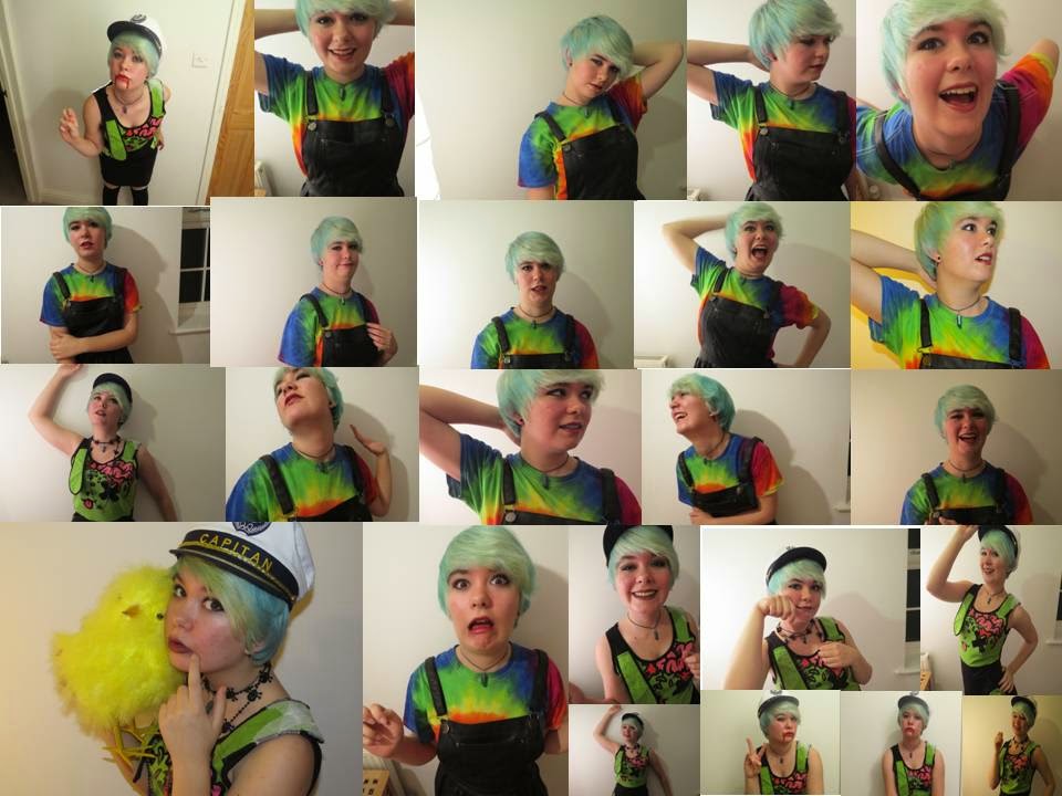
Practise photoshoot for front cover
These are a few photo's I took for a practice photoshoot before I took images that I am actually going to use for the front cover of my magazine. The particular time of day that I decided to take them was a little bit late as it was after school which meant that there was not much lighting in the room. When I take a few more I will ensure that it is an early enough time so that there will be light coming through the windows and the image will not seem as dark.
Thursday, 20 November 2014
Photo manipulation of practice photoshoot
Plan for photoshoot
Model - Amy Denne.
Genre - Rock.
Location - Inside house beside a large white wall.
Make up - Dark red lipstick, black eyeliner and grey eye shadow.
Hair - Short blue straightened hair.
Outfit - Alternative clothing, possibilities including: Black corset, Ripped skinny jeans, a Gothic dress, striped red shirt.
Facial expression - A confident smile
Genre - Rock.
Location - Inside house beside a large white wall.
Make up - Dark red lipstick, black eyeliner and grey eye shadow.
Hair - Short blue straightened hair.
Outfit - Alternative clothing, possibilities including: Black corset, Ripped skinny jeans, a Gothic dress, striped red shirt.
Facial expression - A confident smile
Mockup for double page spread and contents page
Contents page
This design follows the conventions of a regular contents page for a rock Magazine, I am planning to have a large main image with a few surrounding images that include different articles. I feel like this will be an appropriate layout as it is not crowded and gives me enough space to include the quantity of information needed.
Double page spread
As well as the previous mockup, this also follows conventions of a regular rock magazine, usually the main image is either on the right side or left although in certain cases it can actually be used as a background for the entire thing. To avoid the page looking far too busy I have decided to just include my main image on the left hand side of the page so there is a point of focus and my text will be easy to read as it is in a separate box.

This design follows the conventions of a regular contents page for a rock Magazine, I am planning to have a large main image with a few surrounding images that include different articles. I feel like this will be an appropriate layout as it is not crowded and gives me enough space to include the quantity of information needed.
As well as the previous mockup, this also follows conventions of a regular rock magazine, usually the main image is either on the right side or left although in certain cases it can actually be used as a background for the entire thing. To avoid the page looking far too busy I have decided to just include my main image on the left hand side of the page so there is a point of focus and my text will be easy to read as it is in a separate box.
Wednesday, 19 November 2014
Subscribe to:
Posts (Atom)