
Tuesday, 9 December 2014
Monday, 8 December 2014


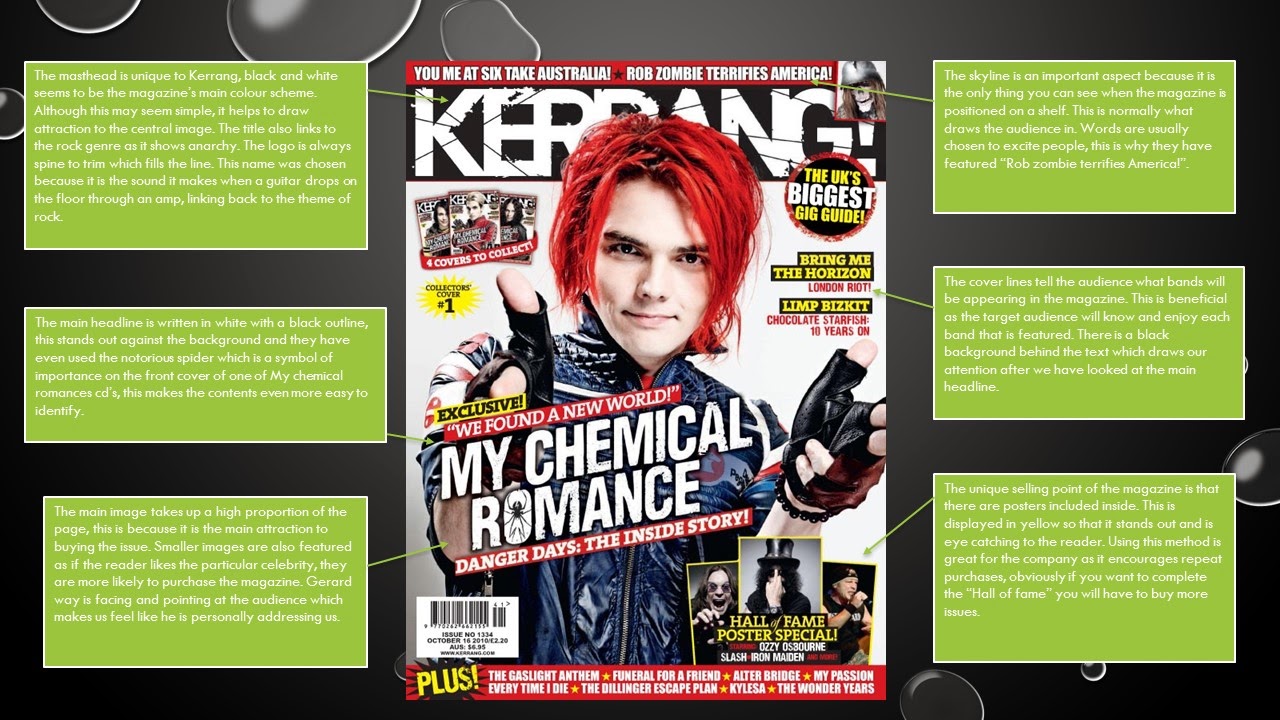
Tuesday, 25 November 2014
Masthead for music magazine

Friday, 21 November 2014
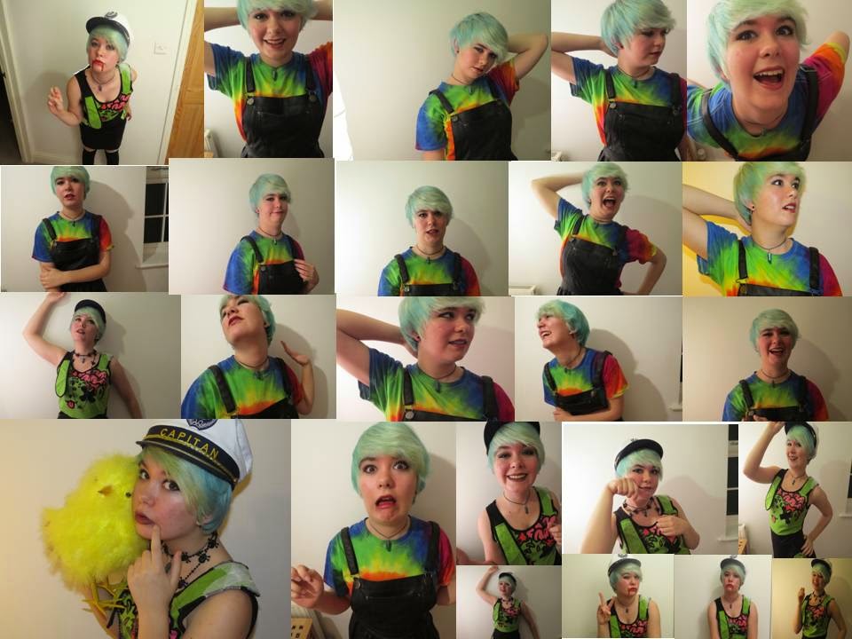
Practise photoshoot for front cover

Thursday, 20 November 2014
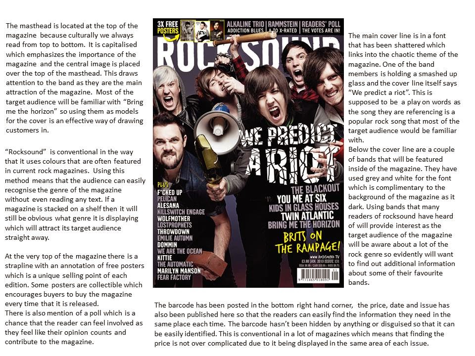
Photo manipulation of practice photoshoot

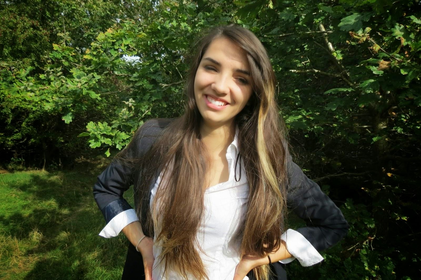
Plan for photoshoot
Model - Amy Denne.
Genre - Rock.
Location - Inside house beside a large white wall.
Make up - Dark red lipstick, black eyeliner and grey eye shadow.
Hair - Short blue straightened hair.
Outfit - Alternative clothing, possibilities including: Black corset, Ripped skinny jeans, a Gothic dress, striped red shirt.
Facial expression - A confident smile
Mockup for double page spread and contents page


Wednesday, 19 November 2014

Contents page - Format research


Sunday, 2 November 2014


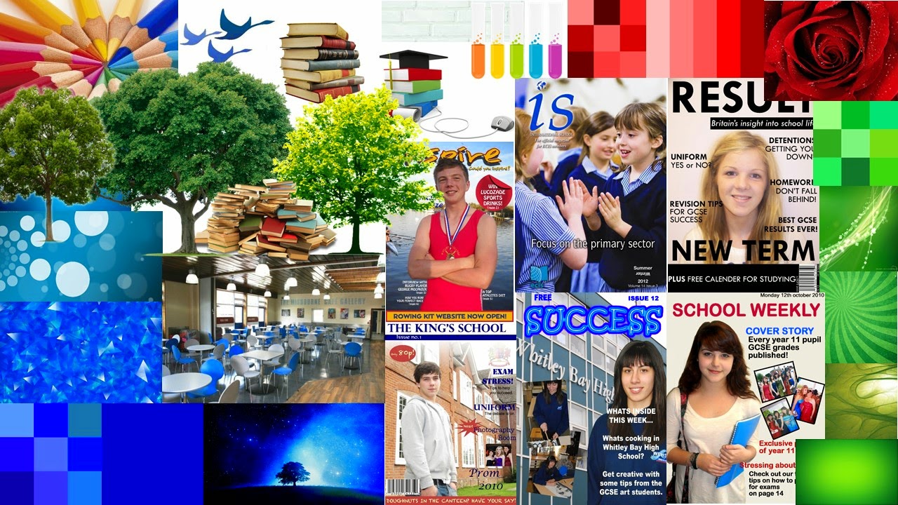
Format research for three rock magazine covers


Wednesday, 22 October 2014

Monday, 20 October 2014

Monday, 13 October 2014


Monday, 6 October 2014


Monday, 29 September 2014
Photo shoot for school magazine


Thursday, 25 September 2014
Thursday, 18 September 2014
Tuesday, 16 September 2014


Subscribe to:
Comments (Atom)