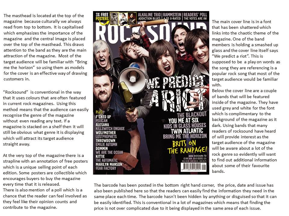


From the format research I did of rock magazine front covers, I have noticed certain trends such as the fact that the masthead is usually bold and in capital letters which emphasizes the importance of the contents within. Most backgrounds for the front cover of a rock magazine are dark with contrasting colours that are usually either red, yellow, blue, green or white.I think this is quite effective as it makes particular phrases jump out to the reader, for example on the "AD" magazine they have put "Falling in reverse" in a bright yellow colour which works well because the target audience of the magazine would most likely know this band. Another feature I will include in my magazine is how a lot of the cover lines range in both colour and font size, this breaks up what is being said and makes key words/phrases stick out to the reader instead of everything just being in a long paragraph that seems incredibly overbearing. A lot of the magazines reviewed have a plug, "Kerrang" often advertises the fact that they have free posters inside which is important as in order to sell well a company needs to have a unique selling point. Without something like this my magazine will not stand out from others.
No comments:
Post a Comment