This blog will be posts based around my Media Studies coursework where I will be analyzing magazines.
Tuesday, 25 November 2014
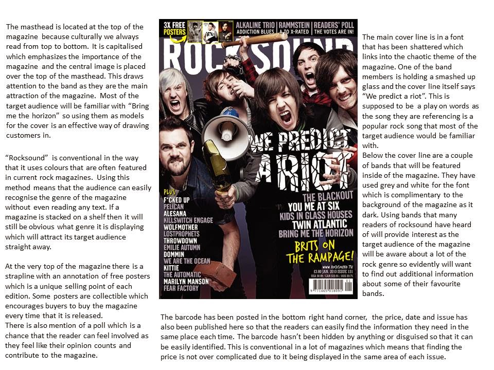
Masthead for music magazine
This is the masthead I will be using for my magazine front cover, using format research I identified that a lot of Punk/Rock magazines have a grunge related theme for the font so I made sure to edit the surroundings of the text so that it looks worn.
Friday, 21 November 2014
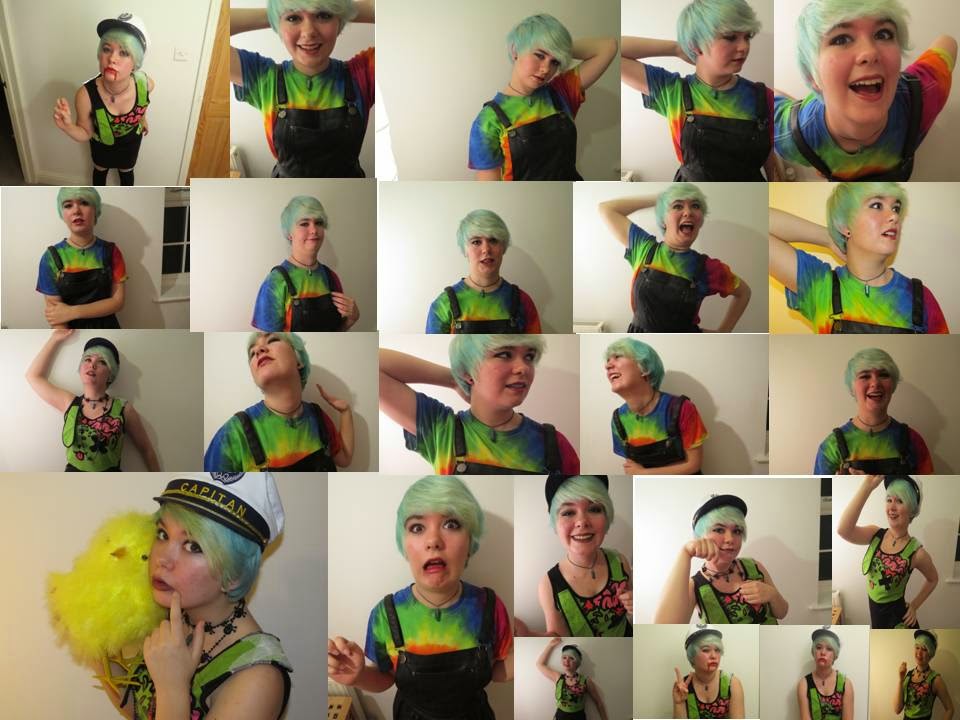
Practise photoshoot for front cover
These are a few photo's I took for a practice photoshoot before I took images that I am actually going to use for the front cover of my magazine. The particular time of day that I decided to take them was a little bit late as it was after school which meant that there was not much lighting in the room. When I take a few more I will ensure that it is an early enough time so that there will be light coming through the windows and the image will not seem as dark.
Thursday, 20 November 2014
Photo manipulation of practice photoshoot
Plan for photoshoot
Model - Amy Denne.
Genre - Rock.
Location - Inside house beside a large white wall.
Make up - Dark red lipstick, black eyeliner and grey eye shadow.
Hair - Short blue straightened hair.
Outfit - Alternative clothing, possibilities including: Black corset, Ripped skinny jeans, a Gothic dress, striped red shirt.
Facial expression - A confident smile
Mockup for double page spread and contents page
Contents page
This design follows the conventions of a regular contents page for a rock Magazine, I am planning to have a large main image with a few surrounding images that include different articles. I feel like this will be an appropriate layout as it is not crowded and gives me enough space to include the quantity of information needed.
Double page spread
As well as the previous mockup, this also follows conventions of a regular rock magazine, usually the main image is either on the right side or left although in certain cases it can actually be used as a background for the entire thing. To avoid the page looking far too busy I have decided to just include my main image on the left hand side of the page so there is a point of focus and my text will be easy to read as it is in a separate box.
This design follows the conventions of a regular contents page for a rock Magazine, I am planning to have a large main image with a few surrounding images that include different articles. I feel like this will be an appropriate layout as it is not crowded and gives me enough space to include the quantity of information needed.
As well as the previous mockup, this also follows conventions of a regular rock magazine, usually the main image is either on the right side or left although in certain cases it can actually be used as a background for the entire thing. To avoid the page looking far too busy I have decided to just include my main image on the left hand side of the page so there is a point of focus and my text will be easy to read as it is in a separate box.
Wednesday, 19 November 2014
Contents page - Format research
In most contents pages I have viewed there is normally more than one image, these are usually strategically placed around the main image and are in boxes which makes it easier to find the article alongside it. There is also a trend when it comes to the background, I have noticed a lot of contents pages have white backgrounds so that there isn't too much going on and we know where to focus. When I make my music magazine I will try to replicate the simple colour theme and use of smaller images.
Sunday, 2 November 2014
Format research for three rock magazine covers
From the format research I did of rock magazine front covers, I have noticed certain trends such as the fact that the masthead is usually bold and in capital letters which emphasizes the importance of the contents within. Most backgrounds for the front cover of a rock magazine are dark with contrasting colours that are usually either red, yellow, blue, green or white.I think this is quite effective as it makes particular phrases jump out to the reader, for example on the "AD" magazine they have put "Falling in reverse" in a bright yellow colour which works well because the target audience of the magazine would most likely know this band. Another feature I will include in my magazine is how a lot of the cover lines range in both colour and font size, this breaks up what is being said and makes key words/phrases stick out to the reader instead of everything just being in a long paragraph that seems incredibly overbearing. A lot of the magazines reviewed have a plug, "Kerrang" often advertises the fact that they have free posters inside which is important as in order to sell well a company needs to have a unique selling point. Without something like this my magazine will not stand out from others.
Subscribe to:
Posts (Atom)